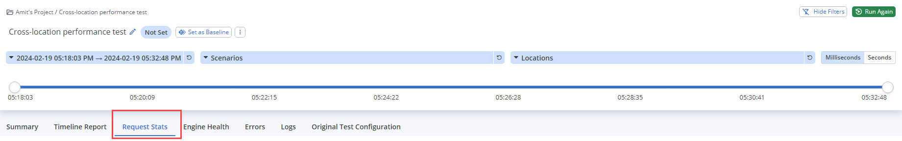
Request stats report
The Request Stats report shows the key performance indicators (KPIs), or metrics, for each element of a test script, so that you can drill down and review the performance statistics (stats) for each element of your test.
- View Request Stats Report
- KPIs per Element
- Aggregated Labels
- Download Report as CSV
- Download Report as CSV via the API
- Link to the Timeline Report
- Link to the Errors Tab
View the Request Stats report
Follow these steps:
- On the Performance tab, select Reports. The most recent reports are shown on top.
- Click Show all reports and select a report to view its details.
- Click the Request Stats tab.
-
(Optional) To specify the time period of the report, move the timeline sliders or Filter by Date and Time. The results for your selected time period are displayed in the results table.
-
(Optional) To define a test run as a baseline for comparison, turn on the Show Baseline Comparison toggle and specify the baseline. You can compare subsequent test runs to the baseline. For more information, see Baseline Comparison.
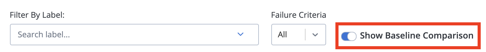
- To filter statistics based on labels, in the Filter By Label list, click all labels that you want to display.
If you select ALL, values for all requests made during the test are displayed. If you used your own JMeter script, this table displays the labels you used in your script.
- Click Apply.
-
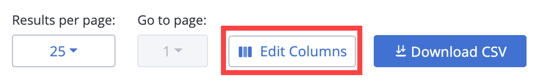
(Optional) To specify the KPIs to be displayed in the table, click Edit Columns.
Examine the list of available KPIs. Drag and drop the columns you want to display into the desired order.
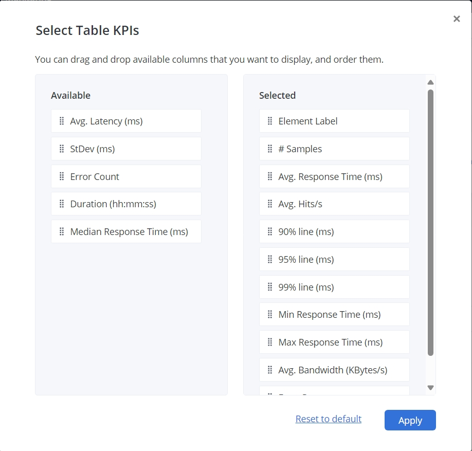

- Element Label
The name of the HTTP Request from the JMeter script. - Avg. Response Time (ms)
The average response time for executed requests. While the test is running, this KPI displays the average of the requests already executed, and the final value once test execution is finished. - 90% line (ms)
90th percentile. 90% of the samples were smaller than or equal to this time. - 99% line (ms)
99th percentile. 99% of the samples were smaller than or equal to this time. - Max Response Time (ms)
The longest time for the samples with the same label. - Error Percentage
The error rate per label. While the test is running, this KPI displays a value based on samples already completed, and a final value after completion of test execution. - StDev (ms)
The standard deviation (a measure of variation) of the sampled elapsed time. - Duration (hh:mm:ss)
The sum of the duration for all samples with the specified label or labels. - # Samples
The total number of samples executed. - Avg. Hits/s
The number of requests made per second. When the throughput is saved to a CSV file, the value is expressed in requests/second. For example, 30.0 requests/minute is saved as 0.5. When the test is done, the KPI displays the throughput for the duration of the entire test. - 95% line (ms)
95th percentile. 95% of the samples were smaller than or equal to this time. - Min Response Time (ms)
The shortest time for the samples with the same label. - Avg. Bandwidth (Kbytes/s)
The volume of traffic in kilobytes per second (KBps). - Avg. Latency
The average latency for executed requests. - Error Count
The number of errors, including response codes and JMeter assertions. - Median Response Time (ms)
50th percentile. 50% or half of the samples are smaller than the median, and half are larger.
Aggregated labels
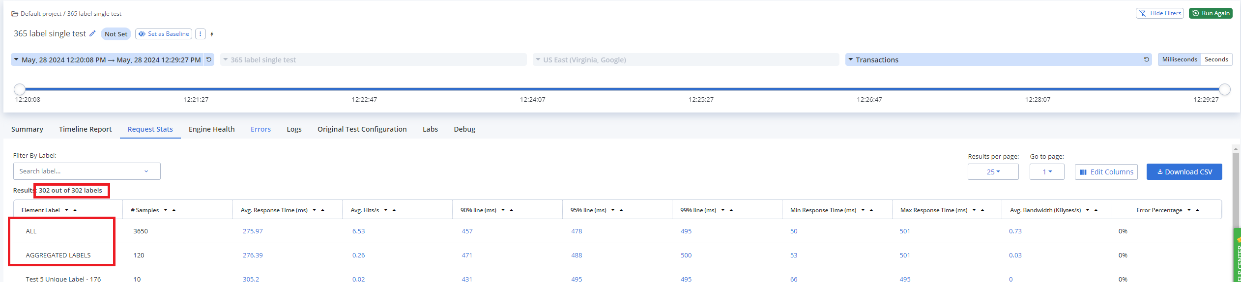
The AGGREGATED LABELS row appears in the Request Stats report if the number of labels per engine or session is more than 300.
The report displays the first 300 element labels executed by your JMeter test. If your JMeter test script has more than 300 labels, the AGGREGATED LABELS row appears directly below the ALL row. The AGGREGATED LABELS row shows only the sample count for those labels beyond the first 300 displayed:
Why are aggregated labels important?
Creating tests with hundreds of labels is not considered to be a best practice. However, sometimes it is unavoidable. Consider a case where you want to test an end-to-end user flow in your application. You can use a multitest with multiple scenarios, each covering a different part of the flow.
The Request Stats report provides a summary of the test results in a tabular format. The table includes an Element Labels column that displays the name of the sampler or transaction that was executed during the JMeter test.
Aggregated labels ensure that your report remains manageable and comprehensible, even when dealing with many labels. Aggregated labels help prevent data overload and maintain the clarity of the report, so that you can focus on the most critical aspects of your performance test.
How to interpret aggregated labels
When you see the AGGREGATED LABELS row in your report:
-
The first 300 labels executed by your test script are displayed normally.
-
The ALL label includes all labels (300+), incorporating them into its calculations.
-
The Request Stats report can be filtered by scenario and location, but the report displays only a maximum of 300 labels per engine.
-
If at least one test in a multitest has more than 300 unique labels, the report will show the AGGREGATED LABELS row. If none of the tests in the multitest have more than 300 unique labels, but there are more than 900 unique labels across all tests, you will NOT see the AGGREGATED LABELS row.
The ALL and AGGREGATED LABELS rows are not included in the 900 report label limit.
Example
In a multitest with two scenarios, where one generates labels 1-300 and the other generates labels 301-600, all 600 labels will be visible in the report.
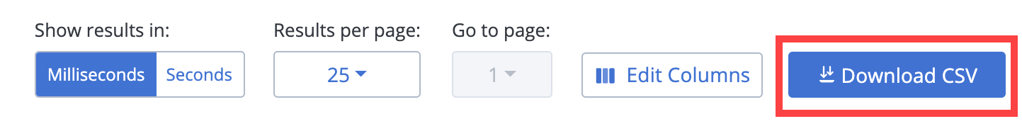
Download a report in CSV format
To download the aggregated report data for the Request Stats Report in CSV format, click Download CSV:
Download a report in CSV format via the API
Report data in CSV format can also be downloaded via BlazeMeter's API.
After a test is executed, you can run an API call to download the file where <master_id> specifies the unique identifier for the test execution, <id> specifies your BlazeMeter user ID, and <secret> specifies your BlazeMeter API key.
curl -o report.csv -X GET https://a.blazemeter.com/api/v4/masters/<master_id>/reports/aggregatereport/data.csv --user '<id>:<secret>'
Link to the Timeline report
When analyzing a performance test report, you can explore specific details, particularly regarding the performance of individual labels during the test run.
On the Request Stats tab, each cell in the following metric columns contains a clickable link to the Timeline Report: Avg. Response Time (ms); Avg. Hits/s; 90% line (ms); 95% line (ms); 99% line (ms); Min Response Time (ms); Response Time (ms); Avg. Bandwidth (KBytes/s).
With the linking capability, you can transition from a high-level overview of test results to a detailed, time-based analysis, which can help in anomaly detection. The relevant graph, corresponding to the selected cell, is automatically displayed in the main chart at the top of the Timeline Report tab.

Suggested flow
-
On the Request Stats tab, access your test results and locate the Error Percentage column.
-
Look for labels with high error percentages which might indicate performance issues.
-
Click the required metric cell to open the Timeline Report.
-
Analyze the time-based metrics displayed for the selected label to pinpoint when and why errors occurred.
Benefits
When you navigate to the Timeline Report, you can take advantage of the following benefits:
-
Targeted troubleshooting. Drill down from aggregate error data to specific time-based details, making it easier to understand the context and causes of performance issues. By viewing errors in the context of the overall performance timeline, you can better identify the root causes of issues, such as specific test phases, traffic patterns, or external factors.
-
Time-based analysis. The Timeline Report provides a visual representation of performance metrics over time, so that you can identify trends, spikes, and drops in performance that correspond to specific events or changes in the test environment.
-
Direct path to data. Instead of manually navigating through different reports, deep links provide a direct path to the most relevant data.
Example
Imagine you are running a performance test and notice that the error percentage for a particular label is unusually high. By clicking on the required metric cell for that label, you open the Timeline Report and see that errors began to spike 10 minutes into the test. By analyzing the timeline, you discover that a backend service failed at that point, causing the errors. This linkage helps you identify and resolve the issue.
Link to the Errors Tab
Steps
-
On the Request Stats tab, access your test results and locate the Error Percentage column.
-
Look for cells with high error percentages which might indicate performance issues.
-
Click the required cell to open the Errors tab.
The selected label is expanded by default.
Jump to next section: