Summary report
The Summary Report is the main dashboard view of your test while the test is running and after it has finished. The Summary Report will appear as soon as your test starts to collect data.
- View summary report
- Summary panel
- Overview
- Graphs
- Generate a printable executive summary (New)
- Generate a printable executive summary (Classic)
View summary report
Follow these steps:
- In the Performance tab, select Reports. The most recent reports are shown on top.You can enter a report name in the search field to view the top 5 reports sorted by execution date.
- Click Show all reports, then select a report to view its details.
A test report overview opens, with the Summary Report as the default view.
Summary panel
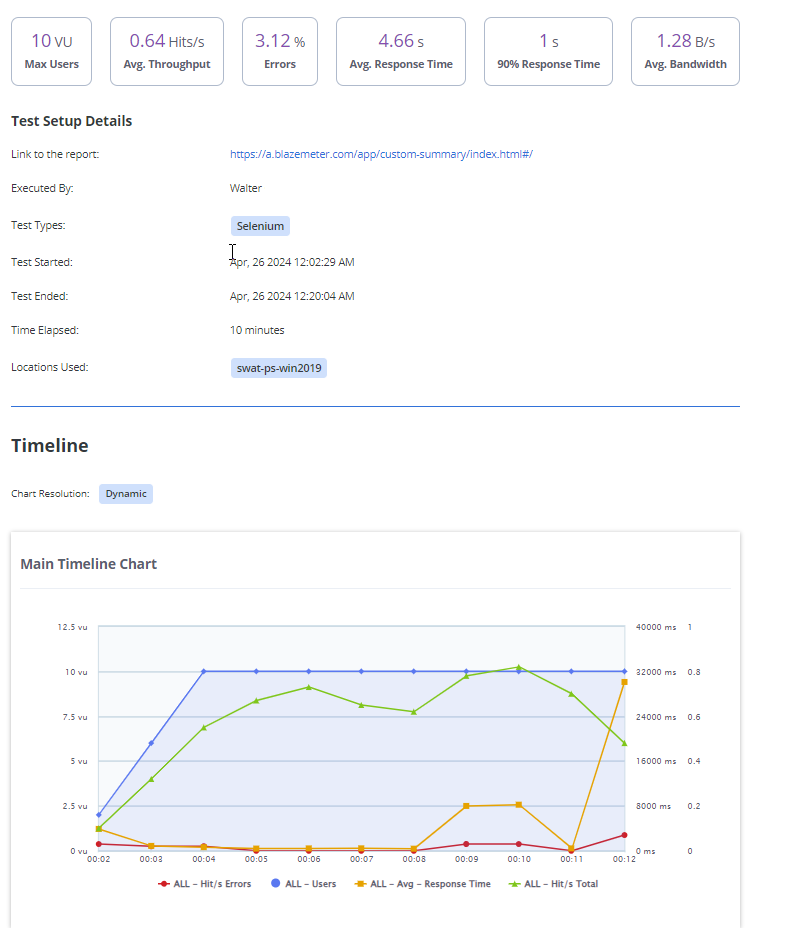
The summary panel at the top of the report shows key statistics of the test compared with the baseline. For more information about baseline, see Baseline Comparison.

- Max Users
The maximum number of concurrent users generated at any given point in the test run is determined according to one-second intervals. First, the maximum number of concurrent users per second is calculated. Then the maximum number of users per minute is calculated by performing a Max Users calculation on all the values per second.Max Users is NOT the number of Total Users, only the total of users who ran simultaneously at any given moment. As a result, Max Users may not match your Total Users, which may be significantly higher.
Example:- At location A, user A sends a request at 20:15:00
- At location B, user B sends a request at 20:15:01
- The maximum number of concurrent users at 20:15:00 is 1.
- The maximum number of concurrent users at 20:15:01 is 1.
- The maximum number of concurrent users at 20:15 is 1 because first the maximum number of concurrent users per second is calculated, then the maximum value per minute is calculated. In this case, it is also 1.
- Average Throughput (Hits/s)
The average number of HTTP/s requests per second that are generated by the test.Throughput for individual transactions (labels) is available on the Request Stats tab (hits/s).A note for JMeter tests: BlazeMeter counts unique requests that appear in the JTL file generated during the test. This means that if only high-level requests are present in the JTL file, the Hits/s figure relates only to the high-level requests. If while configuring the test, you select to include sub-samples in your runs, then HITS/s represents all high-level requests and sub-samples (images, CSSs, JSs and so on). - Errors
The ratio of bad responses out of all responses received. - Average Response Time
The average amount of time from the first bit sent to the network card to the last byte received by the client. - 90 Percentile of Response Time
The top average value of the first 90% of all samples. Only 10% of the sample is higher than this value. - Average Bandwidth (MB/s)
The average bandwidth consumption in MegaBytes per second generated by the test.
Overview
The overview section shows key configurations with the main categories of response codes received during the test run. This really helps you grasp the general purpose and performance.

- The Test Duration (HH:MM:SS)
- The Test Start & End Times.
- The Test Type - JMeter Test, Multi-Test. URL/API Test, Webdriver Test.
- Locations: The geo-locations the load has originated from.
- Response Codes: A breakdown of the HTTP response status codes received during the test run.
- Internal notes about the report.
Graphs
There are two graphs that indicate the key performance metrics and their trends throughout the duration of the test.
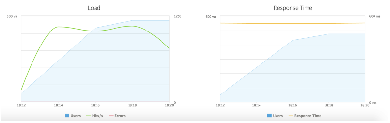
- Load Graph
Shows the maximum number of users versus hits per second versus errors rate. In the example above, you can see that while the load increased gradually until it reached its maximum, the hit/s increased rapidly and remained relatively high for the duration of the test and the error rate stayed at 0%. - Response Time Graph
Shows the maximum number of users vs response times, revealing how the size of the load affects the response times.
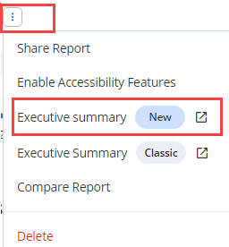
Generate a printable executive summary (New)
You can directly generate a customizable and printable version of a report using the Executive Summary (New) option in the Actions menu.
The Executive Summary is a test report summary you can send to managers or other team members.
This report includes all the components of the performance report, with the filters and view preferences applied by users (see Filtering Report Data).
Examples
The Timeline component in the Executive Summary displays the labels and KPIs selected in the Timeline tab, the selected time range, graph resolution and additional customized charts.
The Request Stats component in the Executive Summary includes the data as displayed on the Request Stats tab, including filters on labels, baseline comparison data, filtered by time, and so on.
Follow these steps:
-
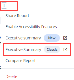
Click the three dots next to your test report and select Executive Summary.
A new page with the test report displays.
-
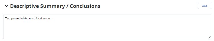
(Optional) At the top of the report, you can write your own summary and conclusions.
The printable executive summary includes:
- Test setup details
- Timeline graph reflecting the Timeline tab, including selected labels and KPIs, multiple charts, and so on
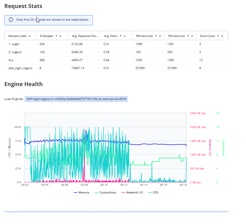
- Summarized request stats report, filtered by the same filter and view preferences used on the Request Stats tab
- Summarized engine health report, filterable by labels
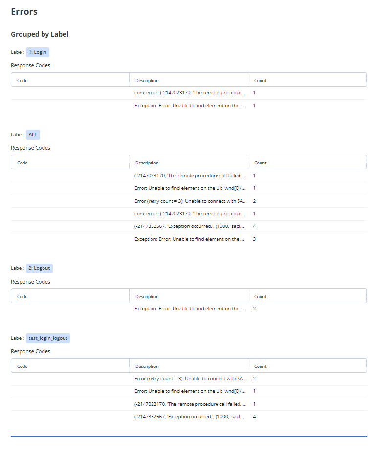
- Summarized error report with response codes, grouped by labels
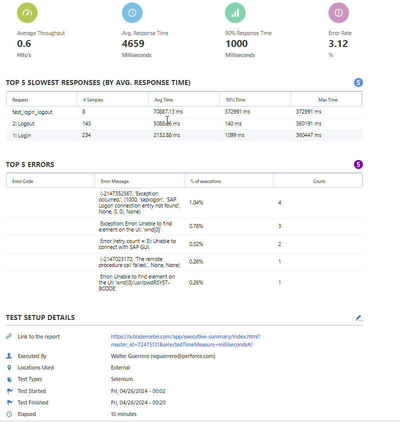
Generate a printable executive summary (Classic)
You can generate a printable version of a report using the Executive Summary (Classic) option on the Actions menu.
Follow these steps:
-
Click the three dots next to your test report and select Executive Summary (Classic).
A new page with the test report displays.
-
(Optional) To customize your report logo, click the edit icon on the logo area.
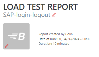 If you have customized your account logo in the Account Settings, your custom logo will display.
 -
(Optional) At the top of the report, you can write your own summary and conclusions.

The printable executive summary includes:
- Top 5 slow responses
- Top 5 errors
- Test setup details
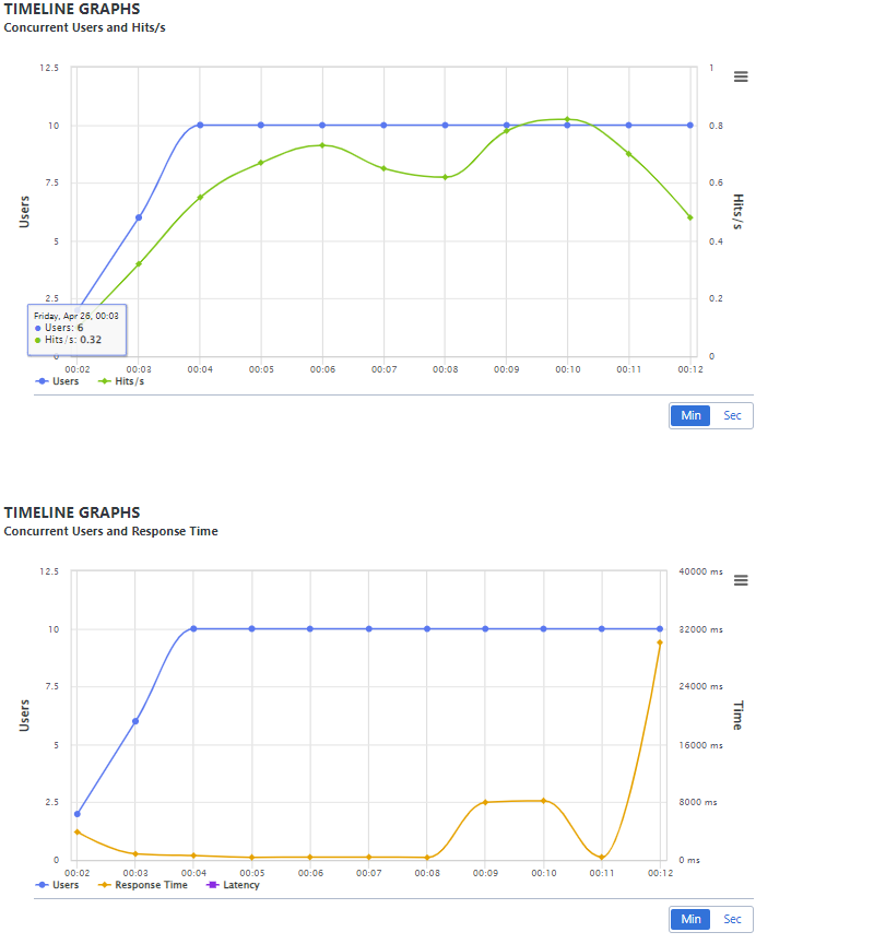
- Graphs presenting users, response times, and hits per second
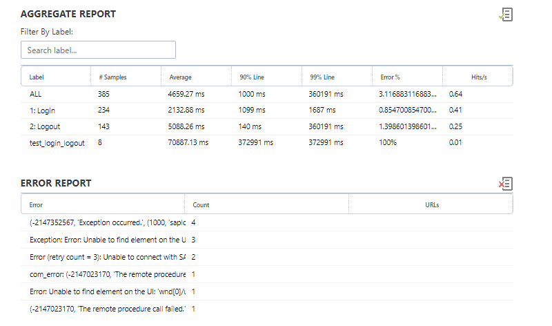
- Summarized aggregate report, filterable by labels
- Summarized error report
Jump to next section: