Timeline report
The Timeline report shows various types of KPIs within one graph so you can easily visualize certain events that might have occurred throughout the test.
- Explanation of the KPIs
- View Timeline Report
- View KPIs by Labels
- View KPIs from APM Integrations
- Download Timeline Report KPI Data
- Sliding Windows
- Use Multiple Charts
- Link to Errors Tab
- View Anomalies
Explanation of the KPIs
- ANOMALIES - RESPONSE TIME shows unexpected or irregular patterns in the time it takes for the application under test to respond to user requests or actions. See View Anomalies.
- VIRTUAL USERS shows how many virtual users are currently active.
- HITS (Hits per second) is the number of HTTP/s requests per second that are generated by the test.
- RESPONSE TIME is the amount of time from the first byte sent to the server to the last byte received on the client side.
- CONNECT TIME is the time it takes to establish the TCP connection, including host name resolution and SSL handshake. It depends on DNS server speed, network latency, and DNS caches. It is recorded in the report every time an HTTP or HTTPS connection was initiated to communicate with the server.
- LATENCY TIME is the time from sending the request and processing it on the server side, to the time the client received the first byte.
- BYTES is the average bandwidth consumption that’s generated by the test per second.
- ERRORS show how many errors occurred.
- RESPONSE CODES are the response codes received.
View timeline report
As soon as your test starts to collect data, the Timeline Report graph shows.
Follow these steps:
- In the Performance tab, select Reports. The most recent reports are shown on top.You can enter a report name in the search field to view the top five reports sorted by execution date.
- Click Show all reports and select a report to view its details.
A test report overview opens. -
Click the Timeline Report tab.

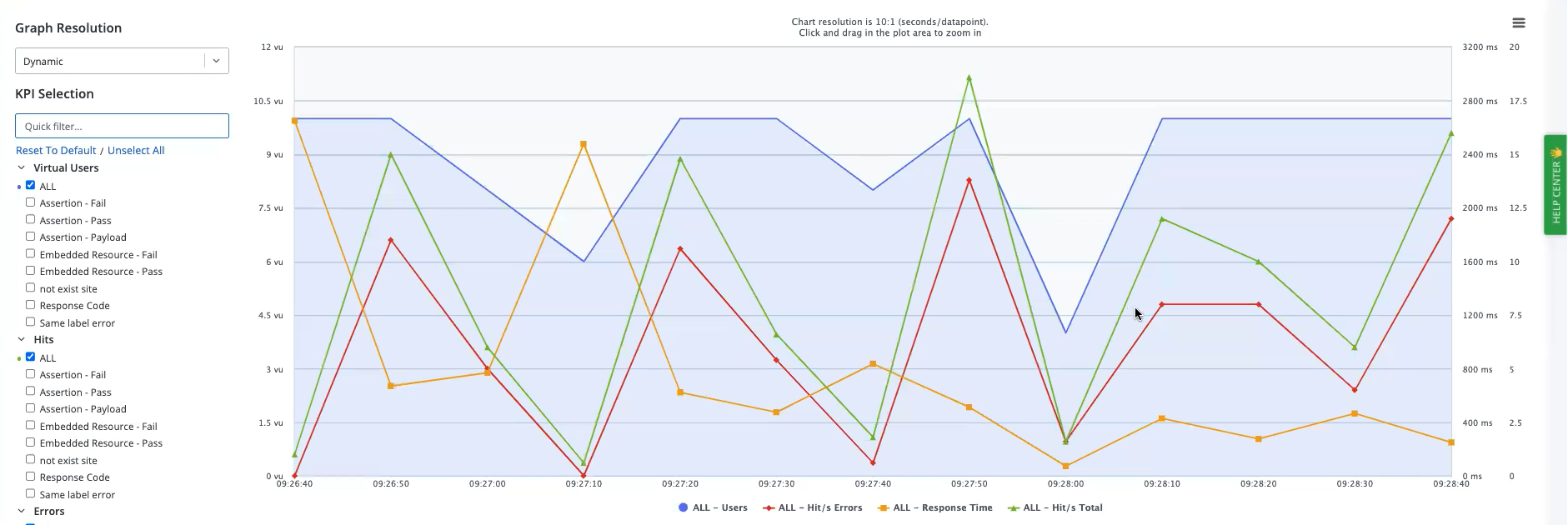
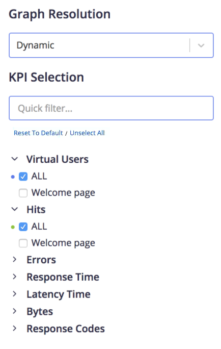
In the Timeline Report window, the KPI selection panel is on the left.
View KPIs by labels
To view KPIs by labels, click the arrow next to each KPI and select the required label from the different options that open. You can select up to 50 KPIs per chart.
Example: Hits of Login in the following image.
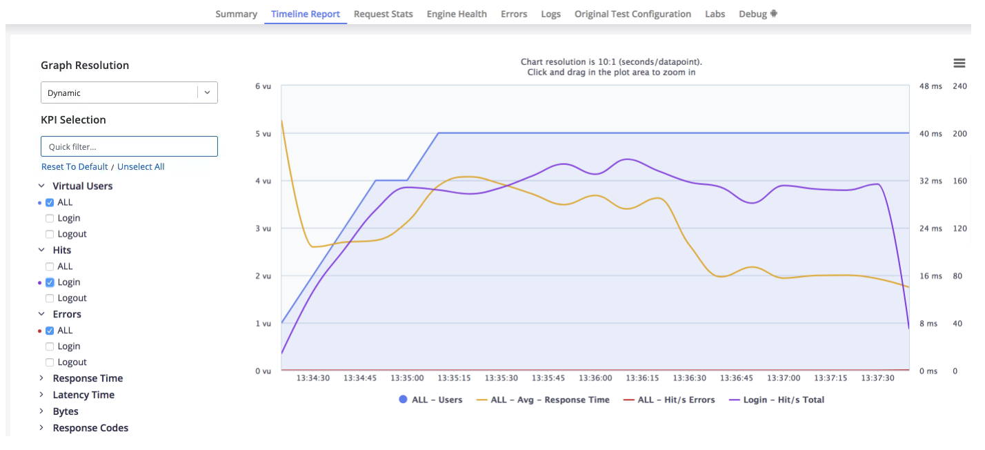
You can see the KPIs that are available for every label in your test.
You can filter the view of KPIs to save a lot of time and manual effort if you have some tests with many labels. If you type a KPI name in the KPI Selection textbox and click Select All, all the labels under this KPI are selected. The KPI Selection textbox is case-insensitive.
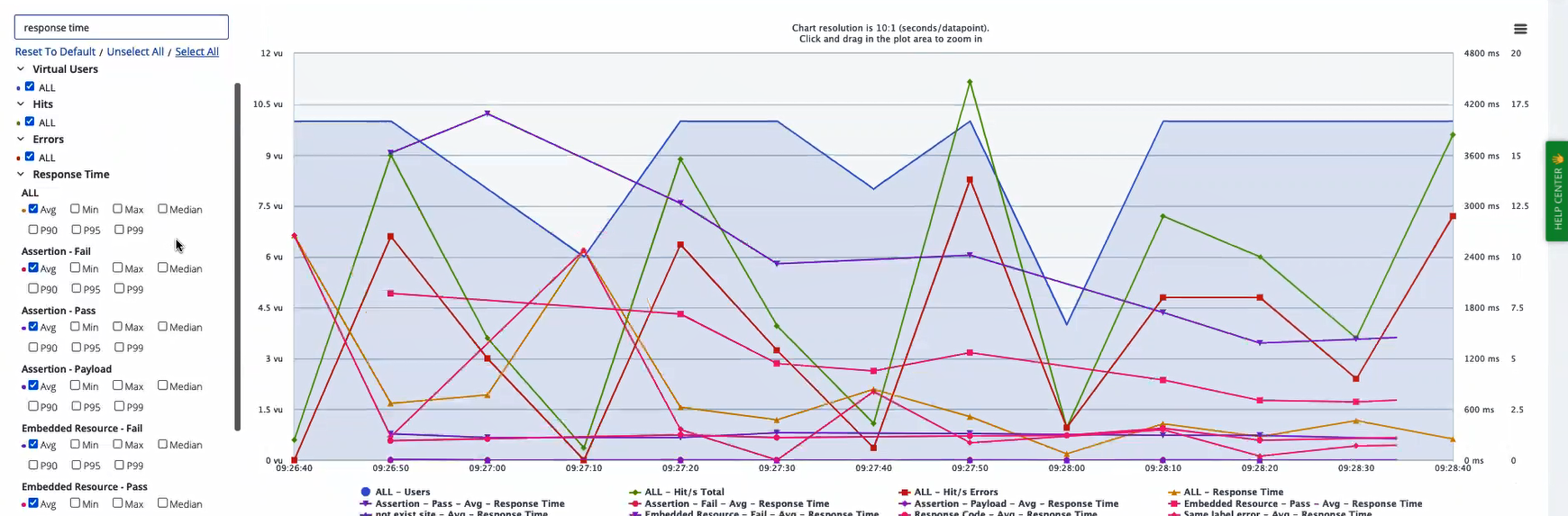
Response time filter
The response time KPI includes many metrics, such as average (avg), maximum (max), minimum (min), median, 90th/95th/99th percentile (P90/P95/P99), and so on. If you type a KPI name and a metric in the KPI Selection textbox and click Select All, all the labels under this KPI, together with the specified metric are selected.
If you type response time in the KPI Selection textbox, the Response Time KPI expands. By default, the Avg metric is selected for All.
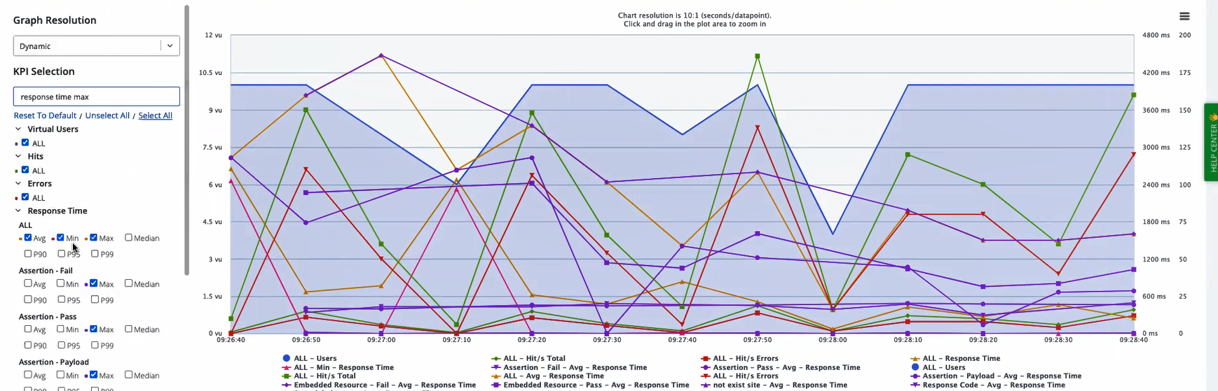
If you click Select All, the Avg metric checkbox is selected for all labels, and the graph updates accordingly.
You can type the name of any available metric in the KPI Selection textbox. If you type max and click Select All, the Max metric is selected for all labels.
Let's say that at the All level, Avg and Min are selected. You type response time max into KPI Selection and click Select All. At the All level, Avg and Min remain selected.
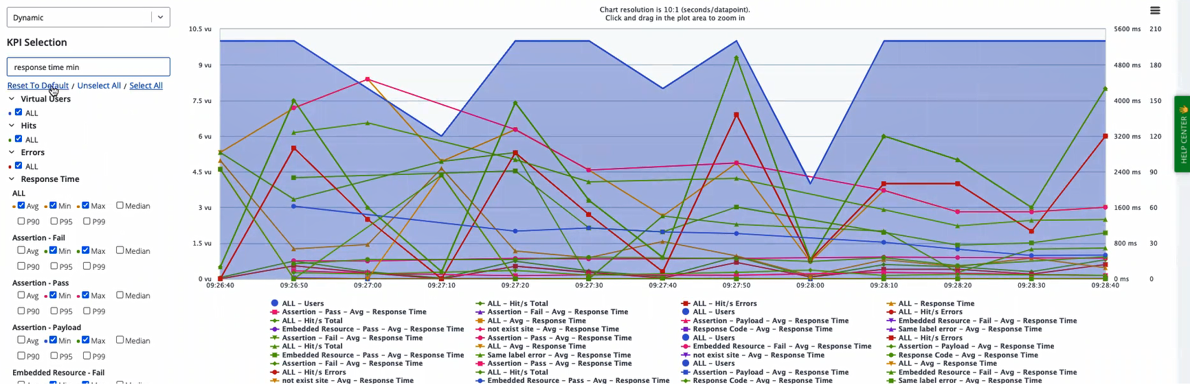
To clear your selection, click Unselect All. To restore the default settings, click Reset to Default.
You can only enter one metric name at a time in the KPI Selection textbox.
A new selection adds to an existing selection and does not remove it. Let's say that you enter a metric name in the KPI Selection textbox such as response time max and click Select All. You then replace response time max with response time min and click Select All again. For each label, all the Max checkboxes remain selected, and all the Min checkboxes are selected.
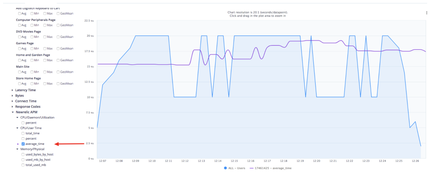
View KPIs from APM integrations
KPIs from APM Integration profiles that you included in your test configuration will appear at the bottom of the list, after the built-in KPIs.
Download timeline report KPI data
You can download the KPI data that BlazeMeter uses to build the Timeline Report via a call to the Time-Series Data API:
https://a.blazemeter.com/api/v4/data/kpis?interval={{seconds}}&kpis[]={{kpi}}&ops[]={{operand}}&master_ids[]={{masterId}}&labels[]={{label}}
The above API call includes the following options:
- {{seconds}}
The number of seconds between each data point generated. - {{kpi}}
The KPI you want to view. This parameter can be used multiple times in the same request to cover as many KPIs as you are interested in. The list of values is as follows:- na: Number of Active threads
- ec: Error Count
- ct: Connect Time
- t: Response time
- lt: Latency
- ts: Time stamp in epoch format
- n: Number of hits per second
- by: Bytes per second
- {{operand}}
This is how you find the average, minimum, or maximum values for applicable KPIs. The list of acceptable values is as follows:- avg
- min
- max
- {{masterId}}
The master ID of the report you want to see the data from. - {{label}}
The label ID of the label you're interested in.
Use of the BlazeMeter API requires authentication per the instructions found in the article Authorization.
Sliding windows
You can evaluate failure criteria by enabling 1-minute sliding windows when creating and editing pass and fail criteria in tests. In the event that failure criteria are triggered, the time frame during which violations occurred is shown in the Timeline report as a sliding window. Sliding windows offer the following benefits:
- Prompt detection of violations against the performance thresholds set in the failure criteria, enabling quick action to address potential issues.
- Proactive approach to test evaluations by offering insights early and frequently during test executions.
- Clear reporting in the Timeline report helps you to easily identify and investigate specific periods of concern, streamlining the troubleshooting process.
To enable sliding windows, create a test, enable failure criteria, and select the 1-min slide window eval option for the criteria required.
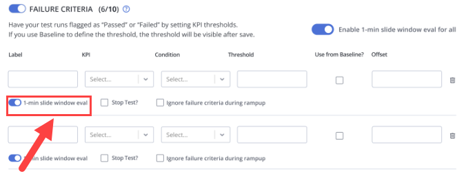
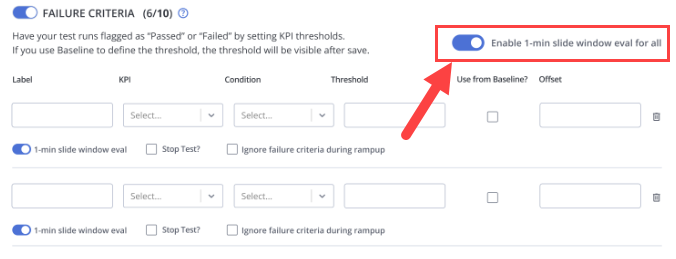
You can set the 1-min slide window eval option for all failure criteria simultaneously so that all failure criteria can stop a test:
For more information, see Failure Criteria.
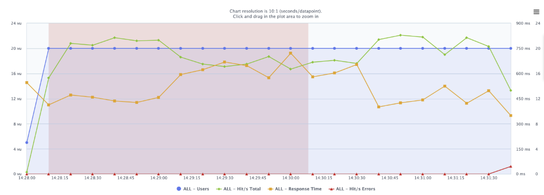
Sliding windows evaluate performance against failure criteria in real time, checking at regular intervals during the test duration. For instance, if a failure criterion is set, such as an average response time exceeding 500 ms, BlazeMeter continuously checks the performance of the preceding minute.
At specified intervals, such as the first minute (01:00), BlazeMeter evaluates the performance of the preceding minute, creating segments (such as 00:00-01:00) for analysis. This process is repeated every few seconds, enabling a detailed examination of performance during the test.
If the designated threshold is exceeded at any checkpoint, BlazeMeter promptly flags it as a violation. This real-time detection allows immediate awareness of issues as they occur during the test, facilitating quicker identification and response to potential problems.
In the event of violations, the Timeline report highlights these periods with a distinct red rectangle. This visual representation makes it easier for you to identify and investigate areas of concern, allowing for efficient troubleshooting and resolution.
Use multiple charts
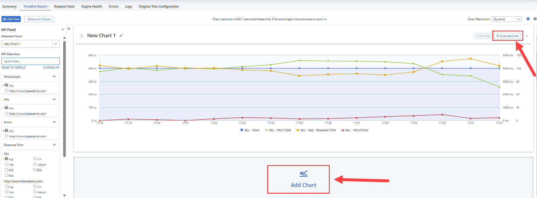
You can add charts to the charts that displays by default. This feature helps you to efficiently analyze reports and identify correlations and anomalies. This capability avoids the need to continuously toggle between selecting and deselecting labels and KPIs, resulting in a time-consuming process. You can customize additional charts, assign names to them, and arrange them in their preferred layout.
Multiple timeline charts let you distribute labels and KPIs across different charts on the page, facilitating a more focused and efficient analysis. This feature enables faster comprehension of data, clearer visualization of trends, and easier highlighting and sharing of conclusions. By leveraging multiple charts in the Timeline tab, you can enhance your performance testing workflows, ultimately leading to more insightful and actionable outcomes.
You can add charts as follows:
-
Click Duplicate Chart next to an existing chart.
-
Click Add Chart below an existing chart.
Link to Errors tab
You can click links from the Timeline Report directly to the Errors tab where errors are grouped by the relevant label. This process is designed to aid you in identifying and resolving issues efficiently.
Each data point in the Errors graph includes a deep link to the Errors tab. Clicking on a data point in the Errors graph opens the Errors tab with the selected label expanded.
If BlazeMeter cannot determine a specific label (for example, due to overlapping graphs), the aggregated All label is expanded by default on the Errors tab.
Benefits
Automated navigation. You do not need to manually navigate to the Errors tab, remember the label name, and locate it in a long list, which is potentially cumbersome and time-consuming. In tests with numerous labels, automated navigation can be helpful in identifying and tracking errors for a specific label.
Example
-
You observe that 10 minutes into the test, label "A" starts returning errors on the Timeline Report tab.
-
You hover over the errors graph for label "A" and click on the link in the corresponding data point.
-
The Errors tab opens with errors grouped by label. Label "A" is expanded by default, displaying all errors associated with this label.
Jump to next section:
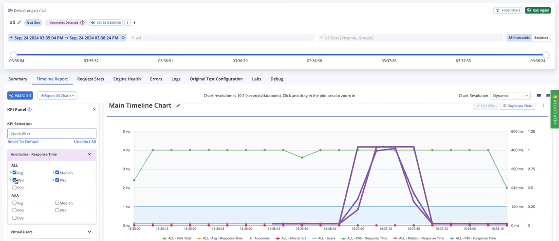
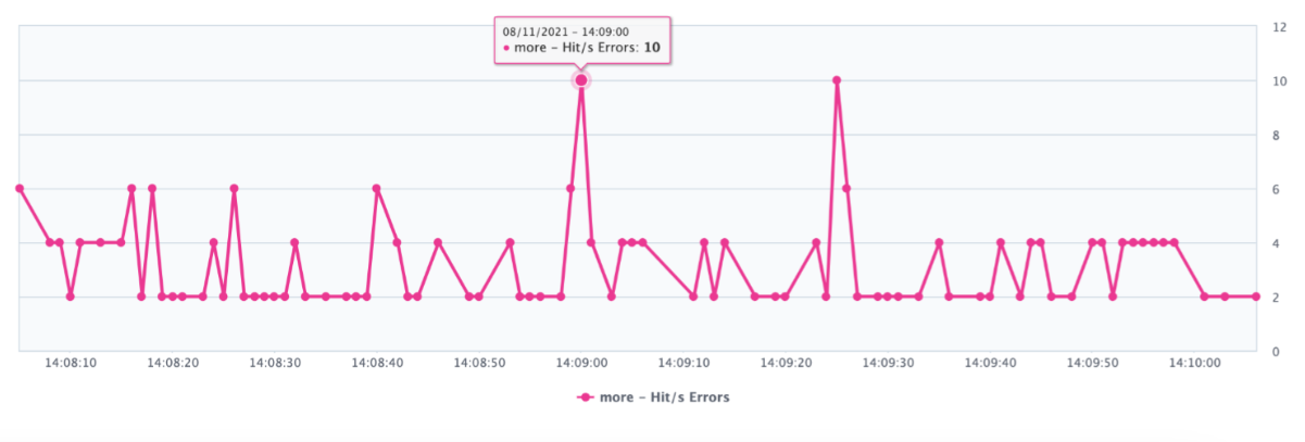
View anomalies
In the Timeline report, anomalies are highlighted on the graph so that users can easily see which label(s) show abnormal behavior, and when exactly the anomaly happened. With that information surfaced, you can focus on the API/endpoint that needs investigation, see what errors occurred during that time, and investigate what else happened during that time that might have caused the issue.
You can view anomalies in Timeline reports to help identify unexpected performance deviations during test runs. This feature uses a statistical model that requires a minimum sample size of 60 data points to detect anomalies effectively.
This feature is available exclusively for Enterprise plans ("Unleashed").
Free, Basic, and Pro accounts do not have access to this feature. To upgrade to an Enterprise plan, contact your BlazeMeter account manager or email sales-blazemeter@perforce.com.
Anomalies are shown for the following metrics:
-
Average Response Time (Avg)
-
90% Response Time (P90)
-
95% Response Time (P95)
-
99% Response Time (P99)
-
Median Response Time (Median)
Anomalies are detected during master test runs but are highlighted in the Timeline chart only after the run ends to ensure accurate and comprehensive analysis. The detection process is optimized to prevent any degradation in BlazeMeter’s performance.
If Scenario, Location, or Transaction filters are applied, anomalies are hidden because detection is not performed on filter permutations. However, anomalies within the selected time frame are displayed when Time filters are applied.
Anomalies are detected and displayed for multi-test reports, ensuring comprehensive analysis across various tests.
Account owners can determine whether anomaly detection is available. For more information, see Manage Environments.
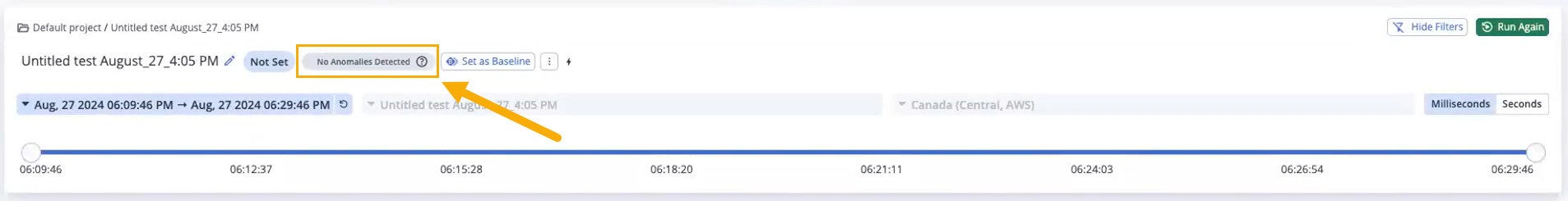
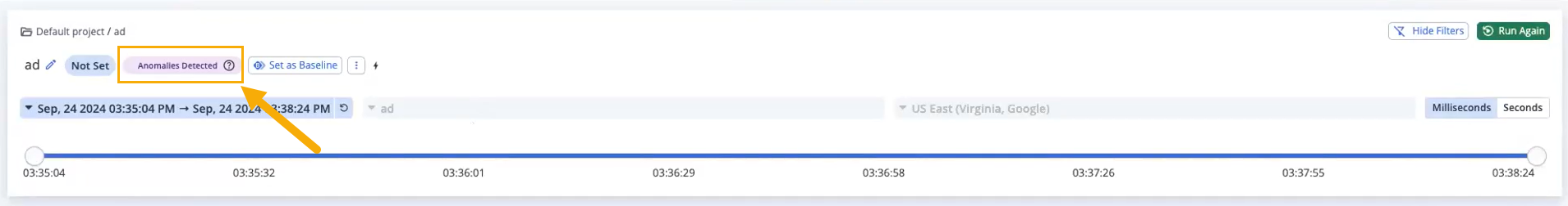
Steps
-
In the Performance tab, select Reports.
-
Navigate to the report of the required master test run.
-
Check the anomalies notification at the top of the screen.
If anomalies were not detected, a notification stating No Anomalies Detected displays.
If anomalies were detected, a notification stating Anomalies Detected displays.
-
To view any detected anomalies, navigate to the Timeline Report.
-
Navigate to Anomalies - Response Time in the KPI selector panel and select the required KPIs.
The anomalies for the selected KPIs are highlighted in the timeline chart.
If you're unsure why certain data points were flagged as anomalies, try adjusting the chart resolution to 1-second intervals. At this resolution, deviations from the mean become more visible, allowing you to see patterns across groups of data points and better understand what triggered the anomaly detection. This adjustment provides a clearer view of data fluctuations, helping you interpret detected anomalies more accurately.